International Sustainable Seafood Foundation (ISSF) Project
These graphics were created in Illustrator for the International Sustainable Seafood Foundation's annual "Status of the Stock" report. The aim of this report is to provide a succinct summary of the health of various tuna populations around the world. I was asked to create a graphic for the beginning of the report that would give the reader an initial sense of the contents of the report.

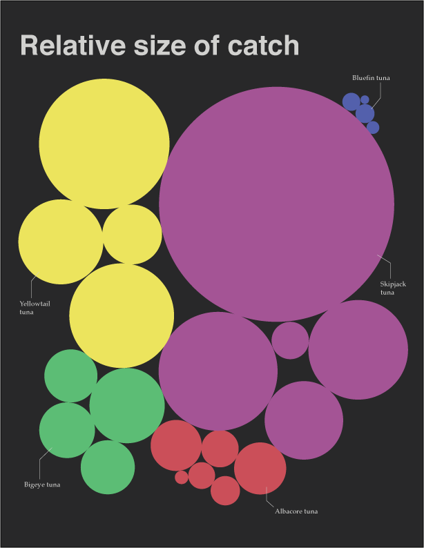
My first concept was extremely simple: create circles proportional to the size of each stock and color them according to species.

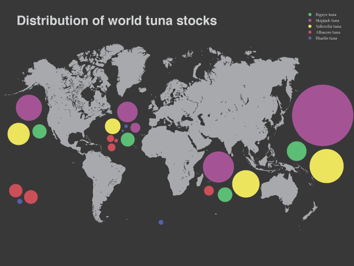
Clearly the simple graphic above does not convey an enormous amount of information. So, to add another dimension I arranged the circles on a map of the world, roughly equivalent to the primary location of the tuna stocks. This display is particularly useful because the stocks are managed by geographic area rather than species.

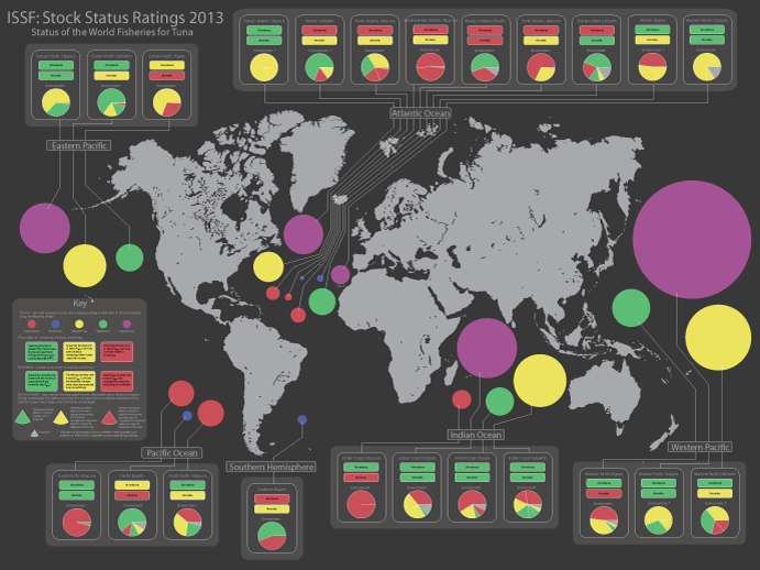
Though useful introductions to the report, neither of the above graphics included any information about the actual health of the stocks beyond their size. In an effort to include more of this information I created the complex graphic below. For each stock there is a box in which color is used to indicate how the stock is doing in 3 categories: mortality, abundance, and environment. The key provides speciic explanation of the meaning of the colors, but at a glance it is easy to get a sense of which stocks are in the best shape just by looking at the overall shade of the box.